
Making pieces to help celebrate life moments is one of my favorite things (and a huge honor!).. and when that life moment is a baby shower, it's all the more special!
The love and anticipation for Baby Jaidi's arrival that got poured into her baby shower details make me want to happy dance all over the place.
There's that saying that it takes a village to raise a child, which is why I LOVE(D) making these advice cards. Watercolor washes in shades of pale peach and pink run behind each title, making it a little easier to separate the cards.
I especially love that after the guests fill the cards, it's kind of like a second wave of gifts for each member of the family. Mom gets to read her advice; Dad reads his advice, and when she gets here- sweet baby Jaidi will have welcome notes people that already love her. More importantly, the new Mom and Dad get to be reminded that they're a team when they cozy up together to read their marriage tips.

baby shower advice cards by hello, bird.
I loved updating my watercolor 'Guess the Birth Date" calendar for Baby J! The calendar was hand-painted with a watercolor wash and loose line work. Throughout the shower, friends + family could fill in their best guess for Baby Jaidi's birth date. (For a little more fun, we left the due date off.)
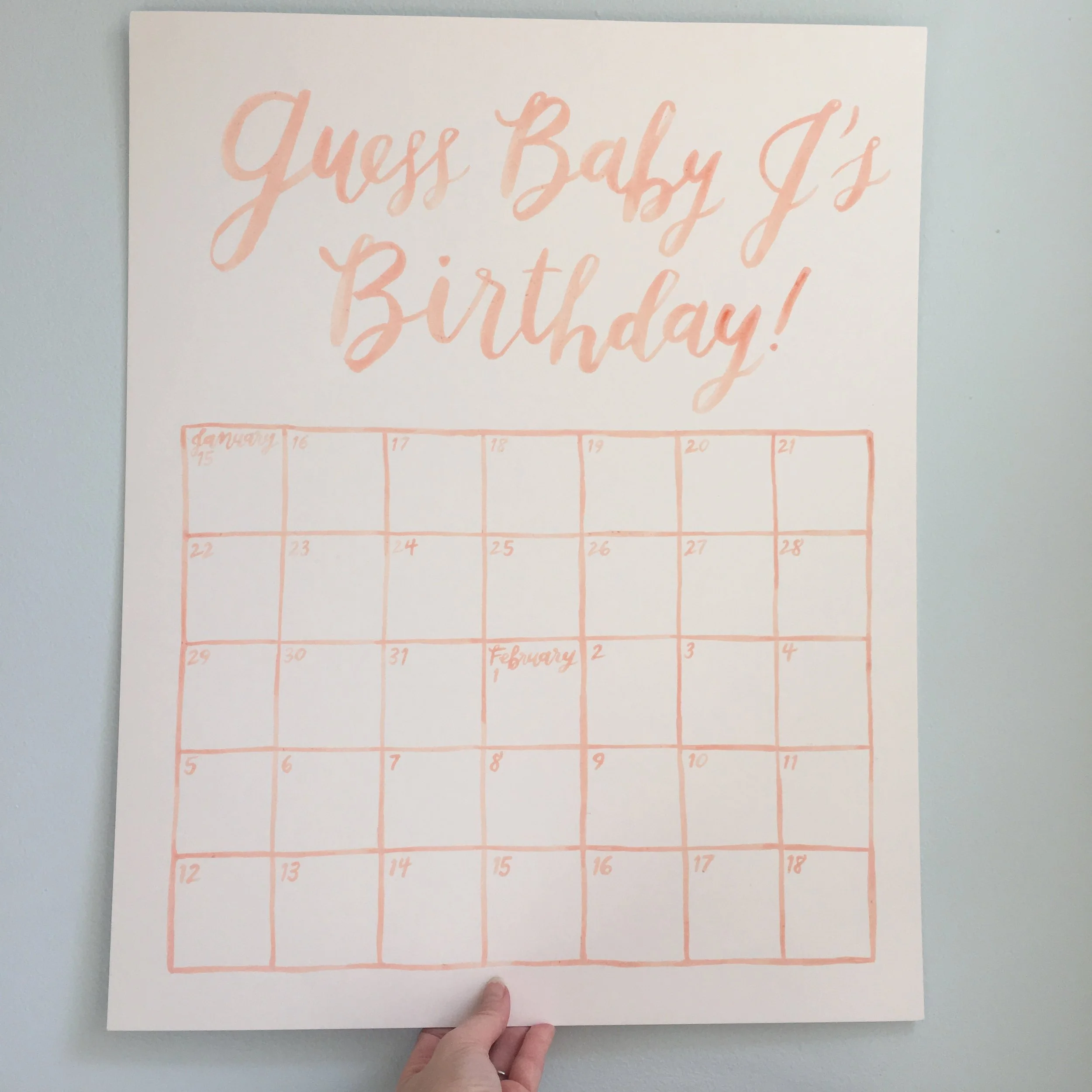
baby shower watercolor calendar by hello, bird.
Thanks again, Chelsey, for letting me be a part of Baby Jaidi's shower! I'm so excited to hear what day she arrives!


