invitations: Sarah's 30th!

Well, it's the last full week of my twenties, and I just remembered that I never shared the fun invitation suite I created for Sarah's 30th birthday!  Sarah is one of my favorite people to work with because she is not only incredibly kind, but is always up for making her paper pieces a mix of fun and formal. 


image.jpg

Sarah was thinking of something pink, gold and feminine with a pop of contrasting black. We went for a good balance, and kept it fun with a nod to the formal.  

I loved creating brush calligraphy for this suite! I put the black brush writing over a perfectly pink watercolor background.  

image.jpg

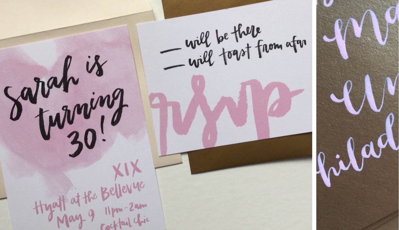
I loved that Sarah wanted a RSVP card for her party to help with the head count, and this is one of my favorite RSVP cards to date.  I kept it clean and simple, with oversized brush lettering.  Each guest's name was added to the top of their RSVP card for a fun touch of formality. 

RSVP envelopes were a deep gold, and each were calligraphed using my signature script style. I wrote "The Birthday Girl" and Sarah's return address on each RSVP envelope in a light pink ink. This ink coordinated with the pink from the invitations. Pink on gold? Yes, please! So fun!

Outer envelopes were deep ivory and calligraphed in my signature script style in a gold ink to make a beautiful formal first appearance in guest's mailboxes. After all, it's the beginning of a new decade- why not mark its importance?! 

custom invitations: hudson loves chelsea

A few months ago, my friend Danielle (of Danfredo Photos + Films) had a crazy/brilliant idea for a wedding she wanted to photograph.  The happy couple?  Her adorable adopted dachshund dogs, Hudson and Chelsea.  That's right-- a dog wedding.  

Danielle's idea quickly turned into a great collaboration among Philadelphia wedding vendor friends, and I loved creating a special invitation suite for Hudson and Chelsea's big day.  Claire Hudson (Pennys & Stamps) created a beautiful watercolor portrait of the couple to be combined with my writing.  

The invitation itself was long and narrow, like Hudson and Chelsea.  The watercolor portrait from Pennys & Stamps is showcased on cream paper, with wedding details below in mint.  

To further emphasize the shape of their invitations + add a little more fun to their guests' mailboxes, Hudson and Chelsea's wedding "tagline" was added to the back of their outer envelopes.  

The response card was a clean and updated classic with mint ink on grey paper. I wrote guest names on each card in the same mint ink for a seamless look.  The reply envelope reversed the color scheme.  

For more on Hudson + Chelsea's big day, visit the Danfredo Photos + Films blog or watch their wedding video.

 Hudson + Chelsea's wedding vendor dream-team: photography: Danfredo Photos + Films  // styling: confetti & co. // paper + calligraphy: hello, bird. // florals: Kate Farley Design // cake + sweets: Saylormade // watercolor portraits: Pennys & Stamps 

all photos in this post courtesy of Danfredo Photos + Films